Viewing performance test results
In brief: TestChimp Executions lists k6 runs (and release batches), opens a detail page with threshold, p95, fail rate, duration, and metric-over-time charts, and lets you overlay a comparable prior run to spot performance degrades.
A wrapper k6 run that ingested successfully appears in the TestChimp web app. That is the system of record for what happened and how it compares—not a local HTML dump you have to keep around.
Where to find runs
Executions → Performance Tests (/executions/performance-tests).
The list shows:
| Column | Meaning |
|---|---|
| Test | Journey or composite name (testchimp.id / file) |
| Type | Load, volume, or both |
| Profile | smoke / load / volume (or your named profile) |
| When | Ingest time |
| Release | Release label when TESTCHIMP_RELEASE was set (editable on the detail page) |
| p95 | HTTP request duration p95 |
| Fail rate | HTTP fail rate |
| Duration | Wall-clock length of the k6 invocation |
| Threshold | Passed / failed against the profile’s checks |
| Commit | Git SHA stamped on the run |
Runs that share a batch invocation (one related-selection execute, one CI job, one release invoke) group as an expandable Batch row with passed/failed counts. Open a row to go to detail.
The same ingest also appears on a release page Performance Tests panel when the run was stamped with that version.
Requires org capability PERFORMANCE_TESTING. Without it, the surface is upgrade-gated.
The detail page
Open a run to see:
- Identity — name, timestamp, branch, load/volume tags, profile, environment, release (inline edit).
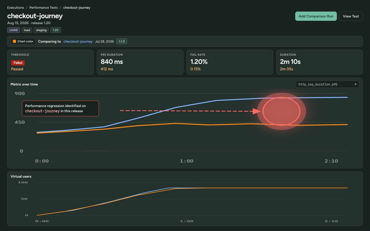
- Headline stats — threshold, p95 duration, fail rate, duration. When a comparison run is selected, each stat shows the prior value underneath in the comparison color.
- Metric over time — downsampled k6 timeseries. Default is
http_req_duration.p95. Pick Failed request rate to see any failure (k6http_req_failed) on the same chart as 5xx / 4xx / 3xx / no response breakdowns when the run attached status-tagged samples. Switch to 5xx alone when you want that class isolated. Older runs without status tags still have the combined fail-rate series only. - Control timeseries — Load runs show virtual users so you can tell a latency spike from “we never actually ramped.” Volume runs show volume size instead (dataset cardinality stepping 10% → 50% → 100% of target) because VUs stay at 1.
- View Test — opens the k6 file in SmartTests (same Git mapping) when a file id is present.
If stderr never printed TestChimp timeseries attach ok, charts show No timeseries was attached. The summary may still have ingested. Fix by using k6/scripts/run.sh (not bare k6 run) so prepare.sh fetches npm @testchimp/k6 latest. See what we capture.
Compare against a prior run
The question you usually care about is not “did this threshold pass?” It is “are we worse than last time, on the same kind of run?”
- On the detail page, click Add Comparison Run.
- TestChimp lists Recommended candidates (same comparison keys: test, environment class, profile, dataset, LLM mode, mock/latency profile) and Other runs if you still want a directional overlay.
- Pick a candidate. Charts overlay both series, re-based to each run’s first sample so different wall-clock starts still align on elapsed time. Headline stats show both values.
- Use Chart color if the overlay needs more contrast. Close comparison to return to a single run.
- Click the comparison name to jump to that run’s own detail page.
Recommended vs other exists because overlaying a smoke run on a 100 VU load run (or staging on a laptop stack) is not a regression signal. Treat Other overlays as directional only.
What a degrade looks like
| Signal | How to read it |
|---|---|
| Threshold Failed vs a prior Passed | This cut misses the SLO you already approved—start here |
| p95 up vs the overlay, threshold still green | Soft degrade: still inside the SLO, worse than last comparable run |
| Fail rate up | Errors under load; pair with Failed request rate timeseries (any failure vs 5xx / 4xx) — a 5xx spike is a server error, a 4xx spike is usually the client/journey |
| VU chart flat while p95 explodes | You likely never reached the intended concurrency (env, seed, or script issue) |
| Volume chart flat at one size while p95 explodes | You likely never stepped the seeded dataset (staircase seed/tenants missing) |
| Overlay series missing | That metric was not attached on the comparison run (older reporter / skipped attach) |
Promoted baselines (CLI promote-perf-baseline / compare-perf-to-baseline) are the same idea for agents and CI: compare only matching envClass + profile + dataset + LLM mode + mock profile. The CLI prints JSON and exits nonzero when comparison.regressed is true. A missing baseline is an error, not a pass. Agents must not silently retarget the baseline or weaken thresholds to make the compare green.
Releases
When you run /testchimp run performance tests for release <label>:
- Ingest stamps
releaseso list filters and the release panel light up. - You can still attach or correct the label on the detail page.
- Compare the cut to the previous release’s comparable run (same profile/dataset), not to an unrelated smoke on another branch.
That is how you answer “did 1.3 get slower than 1.2 on checkout-under-load?” instead of “did k6 print some numbers.” Wrapper runs also store git HEAD SHA; TestChimp auto-tags untagged runs onto the release whose git cut contains that commit. Concept: performance regression testing. Concept metrics: p95, 4xx, 5xx.
CLI / MCP (agents and CI)
Installed MCP/CLI help is authoritative for schemas. Typical tools:
| Tool | Use |
|---|---|
list-perf-runs | History for a journey / environment / release |
get-perf-run | One run, optionally with raw summary / timeseries |
list-perf-baselines / promote-perf-baseline | Named comparable anchors |
compare-perf-to-baseline | Gate: nonzero exit on regressed |
list-related-perf-tests | Inventory for a change set |
get-requirement-coverage --include-perf | Scenario coverage including k6 journeys |
Next
FAQ
Where do I view performance test results?
Executions → Performance Tests. Release-stamped runs also appear on the release Performance Tests panel. Open a row for the detail page.
How do I compare against a prior run?
On the detail page, Add Comparison Run. Recommended candidates share environment, profile, dataset, LLM mode, and mock/latency profile. Charts overlay both series on elapsed time; headline stats show both values.
What does a performance degrade look like?
Threshold failed vs a prior pass, p95 or fail rate up vs a comparable overlay (even if the SLO still passes), a VU chart that never ramped while latency exploded, or a volume-size chart that never stepped.
Why is there no timeseries chart?
The wrapper did not attach downsampled metrics (bare k6 run, missing @testchimp/k6 downsample, or attach skipped). Summary ingest can still succeed. Re-run via run-journey.sh.